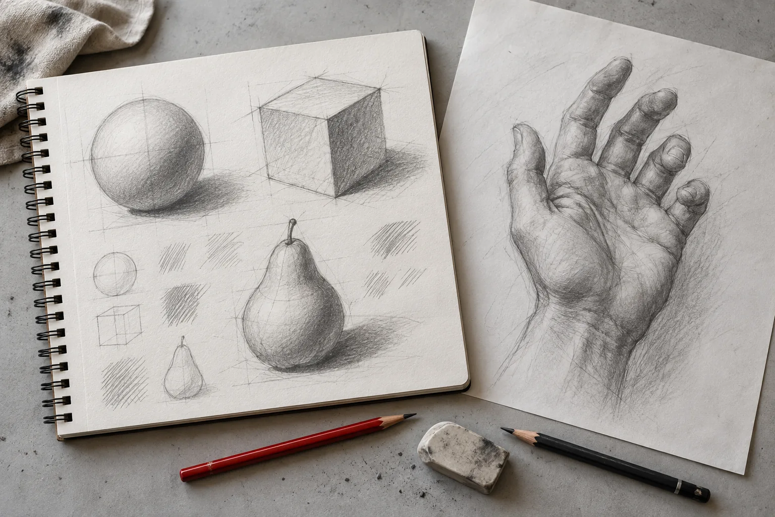
A drawing can have hundreds of careful pencil marks and still feel flat. The problem is often the organisation of the light rather than the amount of effort. Before adding another layer, identify what the values are telling a viewer.
Use a small sphere, an egg or a simple rounded object for these checks. Complex textures make it harder to separate the underlying form from the decoration. Keep one lamp or window as your main light source.
Mistake one: changing the light direction
Beginners sometimes shade each part independently. The top says light comes from above, while a side suggests it comes from the opposite direction. The object becomes difficult to understand.
Draw a small arrow outside your study showing the light direction. Identify the light-facing plane and the main shadow group before shading. If a dark mark contradicts that plan, ask whether it describes local colour, a cast shadow or an accidental pencil decision.
Mistake two: every area is middle grey
When you carefully blend everything, you can lose the difference between light and shadow. A smooth transition cannot compensate for a weak value structure. The result may look grey and muddy rather than three-dimensional.
Make a five-value strip beside the drawing. Compare your light, middle and darkest groups against it. Keep the large light group lighter than the main shadow. Use the darkest values selectively, often near contact or an occluded area.
Mistake three: reflected light becomes a bright border
Light bouncing from nearby surfaces can lift the shadow edge of a rounded object. It does not usually turn that edge into a white line as bright as the directly lit surface. An exaggerated border makes the subject look cut out.
Cover the directly lit region with a small piece of paper and look at the shadow group by itself. Then uncover it and compare. Reflected light should make sense within the overall hierarchy, not compete with the highlight.
Mistake four: a dark outline goes around everything
A strong continuous contour may be appropriate for a stylised drawing, but it can flatten a light-and-shadow study. The outline overrides the softer edge where a lit object merges with a pale background.
Try varying edge strength. Keep a few firm edges where contrast is strong. Let some lighter edges remain soft or suggested. You are describing relationships rather than tracing a sticker.
Mistake five: the object floats above its shadow
An equally soft, detached oval beneath a sphere may fail to show where it touches the table. A contact shadow can help ground the form. Cast-shadow shape and softness depend on the position and size of the light source.
Check the contact point first. Place the darkest small area close to it, then soften appropriate edges farther away. Avoid a universal rule that every cast shadow must have the same sharpness.
A practical correction session
Choose one mistake from your last study. Make a small new sphere sketch and spend five minutes addressing only that issue. Do not revise the whole drawing at once. Compare both studies and write down what became clearer.
Our shading techniques page includes a labeled light-source diagram. The pencil sketching guide explains pressure and layering. If you want guidance on your own decision, see drawing feedback before starting a new study.